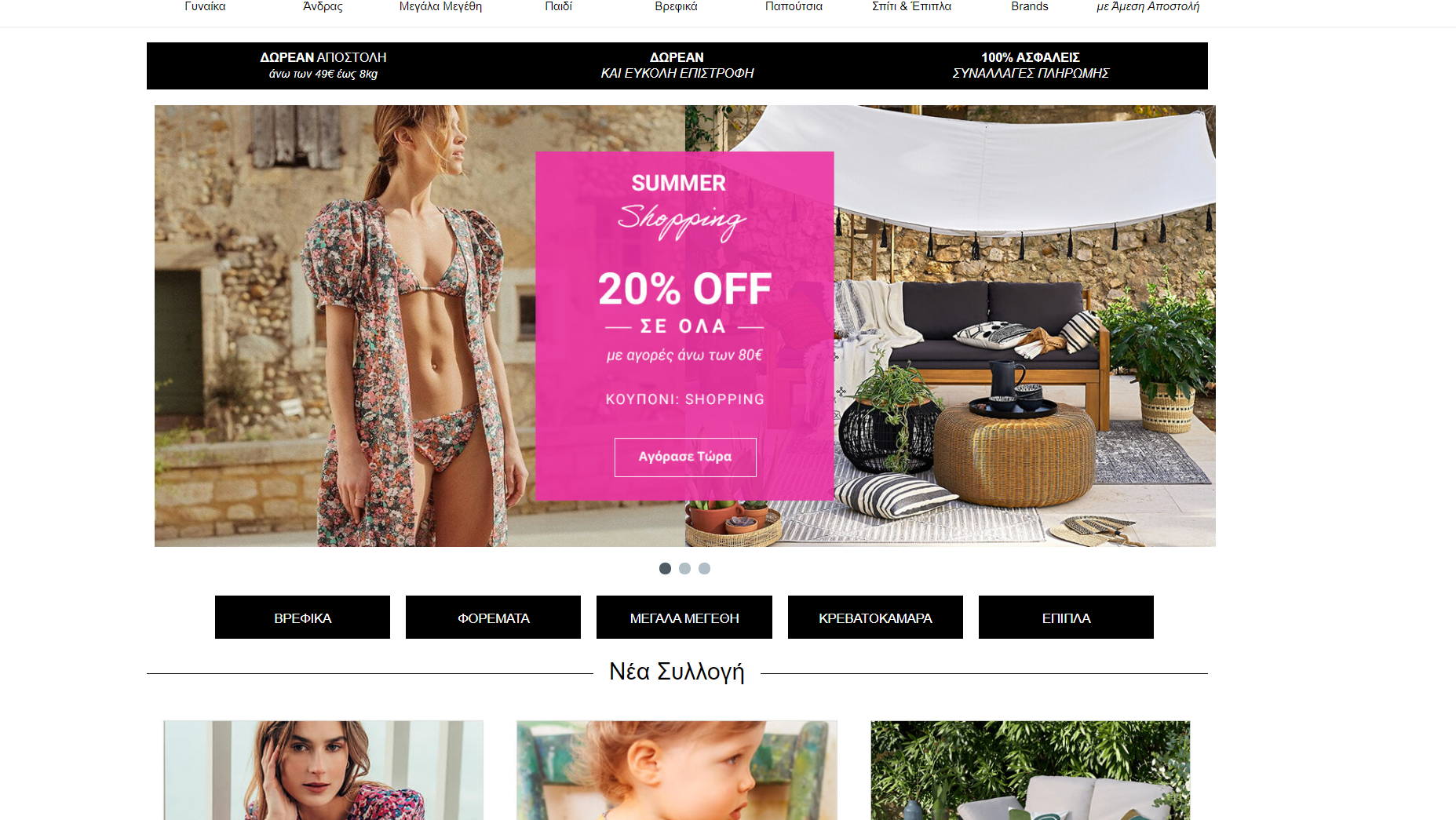
In my time working for N.I. Minoglou in the myshoe - laredoute projects, I happened upon a change in the sister website of the company, namely ancient greek sandals.
During the early stages of our designs for the other two sites, the stakeholders decided to give it a shot and give me ownership over parts of the design, aiming for a better user experience.
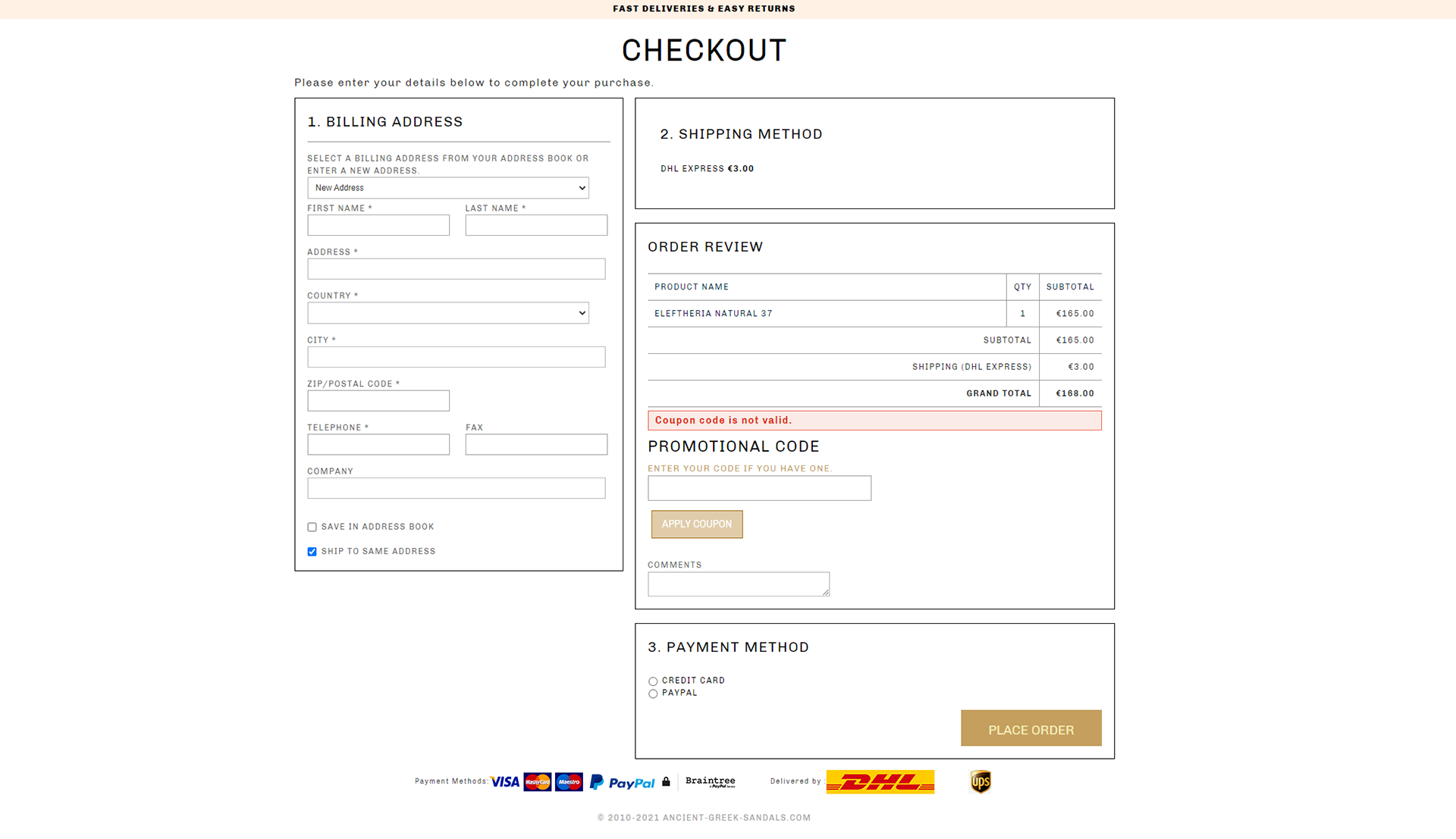
Several attempts and a full checkout page redesign later, we created a new, multi-page, step by step design to change the way people browse and buy from the website.
From "simpler" tasks, such as exposing the filters correctly on product list pages, to changing the main menu layout, we've made a series of drastic changes, leading to overall higher conversion rates - and in this case, aesthetics.
But, we would have to address the main "problem" identified, it being the checkout page.
It was a simple, one-page experience, fast, simple, yet not-so-elegant.
The task at hand was to opt for a multi-page checkout experience, which would be clear to our target audience, since many of our competitors on the market used a similar tactic.
Unfortunately, due to the high risk of the change and the fact that no preparations were made to properly test - or even cross-reference our initial findings - the project was not successful.
At some point, seeing how the changes made deviated from the original plan to optimize the website (you guessed it) for conversions, I was tasked with finding out what went wrong.
That led us back to the testing phase, this time with all eyes on the team.
We found out that the one-page experience was indeed better at converting people. Its simple, yet not-so-elegant layout helped identify this fairly easily, so we reverted back to the original.