The first time I was approached by the team at N.I. Minoglou, it was apparent that they knew what they wanted, but were limited by the means at their disposal. They had no previous experience with a UX/UI Designer and had only outsourced a few projects at that time.
Time was of the essence, so we got down to business.
With the help of the e-commerce team, comprising of two associates and their director, we extrapolated all the data we needed and started creating new personas to further understand our customer and how he/she perceives the customer experience.
Further delving into our customers' habits, we found out that there was no need for a massive re-work of what was already being done, rather than an improvement upon certain features.
Thus began the subtle changes of what I love - boring design.
It was a tedious and long task - understanding how our customers behave, based on what they "know about us" and how we can make it easier for them to "understand us".
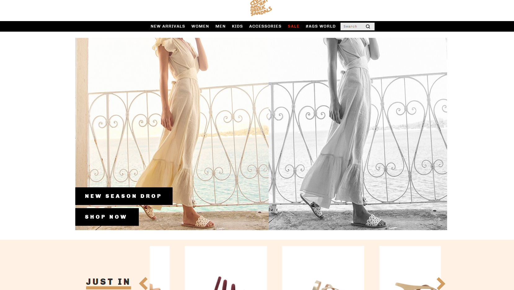
The first thing to tackle was how to best simplify features, such as the search bar.
It may seem mundane by just saying it, but exposing the search bar yielded an astonishing 10% increase in conversion rate (from 1.4% to 1.54%), even though the search solution was not an Ai-based one.
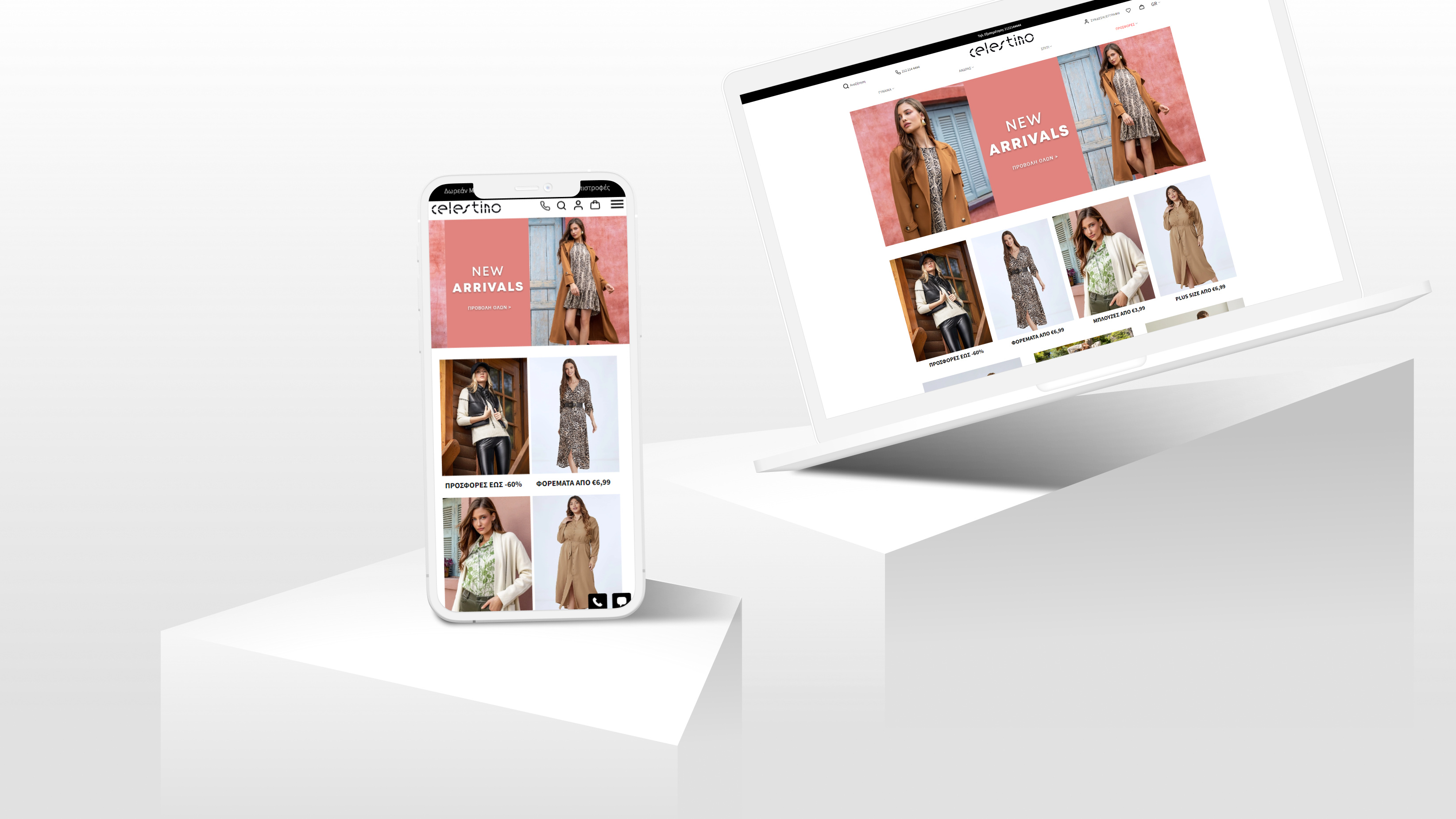
Another facet of the main page (especially the mobile page, as 85% of all traffic were mobile devices) that needed a re-work was the phone icon.
At first, the lack of a phone icon on the header did not raise any eyebrows amongst stakeholders, who best believed that a more "online" approach would be better - aesthetically pleasing AND bringing us conversions.
Our customers thought otherwise.
This was by far the best change we had made. The customers that clicked on the icon did so not for information, but to either order or get informed on their order's status.
That led to an astonishing 50% CR overall (coming from 24% by phone only).
That was a major leap ahead and affected overall design changes, since we implemented said changes with great success on to our other website, laredoute.gr .
Besides working on major campaigns and optimizing for an overall better user experience, we also made some "minor" changes, such as implementing USPs (Unique Selling Points) in our frontpage, making it easier for customers to reach certain products by minimizing the necessary "click depth", changing the background colors from a warm, but old-feeling grey to all-white spaces and changing certain font areas to a more modern-looking and inviting Century Gothic.
Overall, over the course of one year, we've managed to optimize the conversion rate of not only one, but two websites, by implementing what someone might call "the basics" .
You can still see many of the changes made, since its core is still what was designed almost three years ago, on the following links:
